Retina Sprites: Ratios
What is this for?
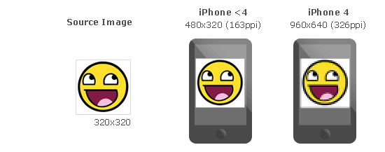
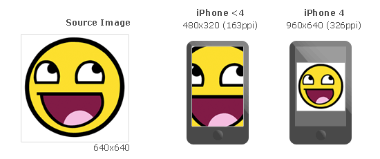
These days, some devices like the iPhone 4, or the new Macbook Pro have screens with higher pixel density than usual. For example iPhone4’s Retina Display doubles the pixel density we use to see on handheld devices.
This change improves the sharpness of vector graphics, but not images... Why? These devices scale vector graphics like text without losing quality, but in order to make images bigger, images are automatically pixel-doubled like in the following example.
How can we solve this problem with high DPI devices? Basically, provide two different version of each image.
And... how can we detect wich image should we use? CSS Media Queries. Modern browsers (anything after IE 8.0) supports them, and they allow us to specify different styles based on the device-pixel-ratio of the browser.
Can glue help? Yes, using --ratios you can choose different ratios you want to build of each sprite. Glue will create one sprite for each ratio and will add all the neccesary CSS magic to make the browser use the high DPI image if the browser needs it. You can also use --retina, it’s a shortcut for --ratios=2,1.
How –retina and –ratios work?
As glue cannot do magic scaling up the source images, it assumes that these images are the biggests you want to serve. (i.e. For iPhone 4 Retina these images should be 2x the final size you want), then glue will create one sprite for each ratio you set in the command line or only 2x if you use --retina:
$ glue icons sprites --retina
This command will generate the following files:
sprites
├── icons.css
├── icons.png
└── icons@2x.png
icons.png
icons@2x.png
And this will be the content of icons.css:
.sprite-sprites-loopback,
.sprite-sprites-weather,
.sprite-sprites-magnify,
.sprite-sprites-chat{
    background-image:url(sprites.png);
    background-repeat:no-repeat
}

.sprite-sprites-loopback{ background-position:-1px -1px;width:32px;height:21px; }
.sprite-sprites-weather{ background-position:-1px -24px;width:24px;height:26px; }
.sprite-sprites-magnify{ background-position:-35px -1px;width:24px;height:24px; }
.sprite-sprites-chat{ background-position:-35px -27px;width:24px;height:22px; }

@media only screen and (-webkit-min-device-pixel-ratio: 2.0),
       only screen and (min--moz-device-pixel-ratio: 2.0),
       only screen and (-o-min-device-pixel-ratio: 200/100),
       only screen and (min-device-pixel-ratio: 2.0) {
        .sprite-sprites-loopback,
        .sprite-sprites-weather,
        .sprite-sprites-magnify,
        .sprite-sprites-chat{
            background-image:url(sprites@2x.png);
            -webkit-background-size: 60px 51px;
            -moz-background-size: 60px 51px;
            background-size: 60px 51px;
        }
}
What about if I need some other ratios?
The option --retina is only a shortcut for --ratios=2,1. You can manually use --ratios=A,B,C... to create different ones.
For example you can use --ratios=2,1.5,1 to make glue build three diferent sprites:
sprites
├── icons.css
├── icons.png
├── icons@1.5.png
└── icons@2x.png
Wich ratios should I target?
Is up to you, but using 2 and 1.5 should be enough for most of the devices.
Here you have a list of suggested ratios for some famous devices, (full list):
| Device | Screen size | dpi | Suggested ratio |
|---|---|---|---|
| iPad | 2048 × 1536 | 264ppi | 2 |
| iPhone 5/5S/5C | 1136 × 640 | 326ppi | 2 |
| iPhone 4 | 960 × 640 | 326ppi | 2 |
| iPhone 4S | 960 × 640 | 326ppi | 2 |
| iPad (3rd gen) | 2048 × 1536 | 264ppi | 2 |
| MacBook Retina | 2880 x 1800 | 220ppi | 2 |
| Xperia S | 720 × 1280 | 342ppi | 2 |
| One X | 720 × 1280 | 312ppi | 2 |
| EVO LTE | 720 × 1280 | 312ppi | 2 |
| Galaxy Note | 800 × 1280 | 285ppi | 2 |
| Galaxy SIII | 720 × 1280 | 306ppi | 2 |
| Galaxy S4 | 1080 × 1920 | 441ppi | 3 |
| Galaxy Nexus | 720 × 1280 | 316ppi | 2 |
| Nexus 4 | 768 × 1280 | 320ppi | 2 |
| Nexus 5 | 1920 x 1080 | 445ppi | 3 |
| Kindle Fire HDX 8.9 | 2560 x 1600 | 339ppi | 1.5 |
| Kindle Fire HD 8.9 | 1920 x 1200 | 254ppi | 1.5 |
| HTC Desire | 480 × 800 | 252ppi | 1.5 |
| Nexus One | 480 × 800 | 252ppi | 1.5 |
| Sensation | 960 × 540 | 256ppi | 1.5 |
| Evo 3D | 960 × 540 | 256ppi | 1.5 |
| Sensation XE | 960 × 540 | 256ppi | 1.5 |
| LG Optimus 2X | 480 × 800 | 233ppi | 1.5 |
| Defy+ | 854 × 480 | 265ppi | 1.5 |
| Milestone | 480 × 854 | 265ppi | 1.5 |
| Nexus S SAMOLED | 480 × 800 | 235ppi | 1.5 |
| Nexus S LCD | 480 × 800 | 235ppi | 1.5 |
| Galaxy S Plus | 480 x 800 | 233ppi | 1.5 |
| Galaxy SII | 480 × 800 | 219ppi | 1.5 |
| Galaxy Tab | 600 × 1024 | 171ppi | 1.5 |
| iPad mini | 1024 × 768 | 163ppi | 1 |
| iPhone | 480 × 320 | 163ppi | 1 |
| iPhone 3G | 480 × 320 | 163ppi | 1 |
| iPhone 3GS | 480 × 320 | 163ppi | 1 |
| iPad (1st gen) | 1024 × 768 | 132ppi | 1 |
| iPad 2 | 1024 × 768 | 132ppi | 1 |
| Kidle Fire | 1024 × 600 | 169ppi | 1 |
| Galaxy Y (S5360) | 240 × 320 | 133ppi | 0.75 |